For years, I’ve known that I had a book me in. I wasn’t sure what that book was, but I knew it was there.
I’d had many starts and even more stops (funny to have more stops than starts, huh?).
The challenge is thinking about the book as a whole and understanding what the end will look like.
I’m not sure how fiction writers think of it… or even how other non-fiction writers think of their book writing process, but I found that once I understood how the book would look in the end, it came pretty quickly and easily.
Earlier this year, I had a very clear vision of what this book should be. I knew how long it needed to be and I knew that it had to be different than any other business book out there. In fact, the only real writer's block I had during the process was when I tried to depart from my original vision and not talk about World War II (curious yet?).
I know there a lot of people out there that devour business books (or non-fiction books in the genre they are interested in). I, personally, don’t. I really have a hard time not getting bored. There are a few out there that don’t bore me (you can read my book to know which I recommend). I usually will devour non-fiction pretty quickly.
The biggest challenge that I had to overcome is that I had to write a book that was going to be of interest to me… it had to be a book that I could sit and read through without my ADD kicking in and taking over.
So, what was the answer to solve this problem?
Why pictures, of course.
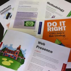
Don Elliott, in my office, is a very accomplished illustrator. He knows how to illustrate cartoons as well as more serious images. The more I thought about it, the more I realized that I needed his artwork in my book.
While the artwork in the book is all drawn by him, it really represents how I think of things. When I explain things to people, I like to draw pictures. Give me a marker and a whiteboard and I’ll draw you something that will help you understand the concept more quickly than any thing else.
It didn’t occur to me until the writing of this blog post why that was the case. Really, it comes down to story telling. So, that is why there is another key aspect to my book (you know, I needed to make it work for me). That other aspect is telling stories.
You may not think how the first solo pilot to fly across the United States, the founding of Disneyland or World War II propaganda relate to Web strategy, but they do. You may not see how building a house or Biff’s Cheese Shack relate to marketing your business online, but they do. You may not see how Harley Davidson Motorcycles or high-definition television help you do more online, but they do. In fact, I think that because I was able to tell these stories, the book practically wrote itself. It made it easy for me to convey the message I needed… it made it easy to draw the pictures (in my mind) that made the story work.
I think the single, most important part of the entire book is that it’s different. My publisher (Aloha Publishing) really wanted to book to be more standard. More standard in size. More standard in the language used. More standard in how my bio was written. Originally, they encouraged it to even be in black & white. My response to all that is that standard is boring. There is no intrigue in doing things the way everyone else does it. There is no way to truly stand out on the shelf if I look like everyone else. When you buy your book and see the little picture above the barcode, you’ll now understand why it’s there.
The book will be out soon. We now have approved the final color proof. I’m not sure of the exact release date, but it will be out soon.
Now, I’ve got to get going on my next book (apologies to my wife, kids and employees in advance).