Mobile Web Requires Accommodations

I remember a few years ago that I thought that mobile use of the Web would require very small consideration.
I first used my mobile phone to browse the internet back in 2005 and didn’t really like it because it was slow and the websites didn’t look good on my little phone. They simply were not optimized for Web traffic.
Times have changed. I use my phone to browse the Web a lot. More and more people are doing the same.
According to Fierce Mobile Content, mobile and tablet (an offshoot of mobile) generate about 8.2% of US Web traffic. In fact, the iPad alone represents about 25% of all mobile Web traffic.
The challenge for businesses (as well as developers) is to make the experience reliable for all Web users. It’s important that we have a rich experience for your normal website visitors for their desktops but you also want an experience that makes sense for the mobile users… whether those mobile users are on a small smartphone or a tablet, such as the iPad.
A common approach for building a mobile website has been to create an alternate website for your mobile visitors to see when they use their mobile platform. There is a big problem with that approach. When you go to a mobile website, it is usually (if done right) optimized for phones and not for tablets. In fact, the experience tends to be a little awkward on tablets because of the touch optimized buttons designed for tiny screens.
An approach that I favor is a responsive website design. A List Apart had a great article on this concept of Responsive Web Design in May, 2010. The concept is simple… the website changes it’s presentation depending on the browser size you are looking at.
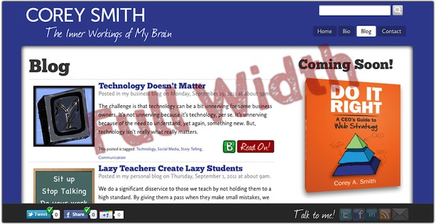
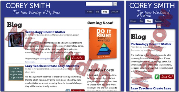
You can use my website as a pretty good example of this. You probably won’t be able to see this in Internet Explorer but if you are running Firefox, Chrome or Safari (you should make the switch if you haven’t) you’ll be able to see this in action.
Do this now
Resize the browser window. Simply take the corner of your browser and make it smaller (narrower) and you’ll see the content will shift. Images will get smaller. If you make your Web browser as narrow as a mobile phone, you’ll even see how it would look in your mobile phone. The other way you can do this is go to my website using your mobile phone. I’ve included a QR code at the top of this post (if you know what that is) so that you can just scan it with your phone and see this in action.
I’ve included a couple of images in how this works as well just in case you can’t figure how how to resize your browser window.
What this means?
When I redesigned my website here, I was originally going to have a mobile version of the site that was optimized for touch, but I thought it would make more sense to have a responsive website design. Here is what I really liked about responsive Web design for my website.
- It meant that I didn’t have to rethink the user interface. I didn’t have to make a decision as to what content was included and what was left out.
- I didn’t have to write a bunch of extra code to make it work.
- Most importantly, I didn’t have to as much spend time or money to create a second website that would present my content for small phones.
There are some drawbacks to responsive Web design. It’s not a decision that will work for everyone. Some people will still want a mobile version of their website. If you are considering making the decision to use a responsive Web design for your website, consider a few challenges that could crop up.
- Your users usually cannot resize their browser window in the mobile device as easily so small text could be harder to read.
- Your content may not work well (e.g. eCommerce heavy websites may introduce more problems than are solved).
- You must make different concessions on how things will look. Images will shift and you may need some to go away. However, even a mobile website will have this consideration.

Corey Smith and his wife are the proud parents of five wonderful children and live in Meridian, Idaho. He is the president of Tribute Media, a Meridian based Web Consulting firm.
He is the author of two books, "Do It Right: A CEO's Guide to Web Strategy" and "Tweet It Right: A CEO's Guide to Twitter." You can learn more about his books here.
Interested in having Corey speak for your organization? Need help building or marketing your organization? Want to tell Corey how cool you think he is?