Mobile Site or Responsive Design?

I’ve talked in the past about a mobile responsive Web design in my post Mobile Web Requires Accommodations. I talk in that post about a responsive Web design.
In short, a responsive Web design is a website that doesn’t care what size the web browser is… it just looks good. The idea is, quite simply, it looks good all the time whether you are viewing your website on a desktop computer, tablet or a mobile phone.
The concept has only really been around for a little over a year and a half and really is groundbreaking in how we look at designing websites for mobile (or even for desktops). It allows us the ability to actually consider the mobile device right at the beginning of the design phase of a website which actually allows us to produce a better website.
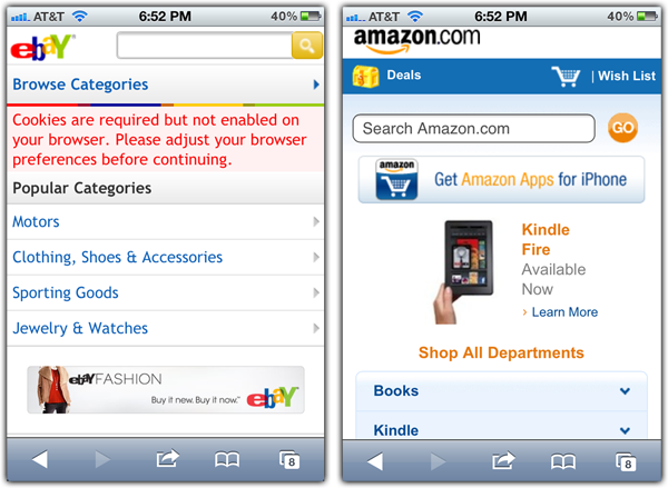
Prior to this concept of responsive Web design, mobile sites were designed as separate websites that would present different information but in a way that works well specifically for the mobile device. You’ll be familiar with this approach if you’ve been to eBay or Amazon on your mobile device. You’ll see that the website is actually very different from their desktop version of the website.
This is an incredibly expensive approach but may, for the time being, still have it’s place. I think, however, it’s place is going away and a responsive design is going to be more important going forward.
 In my post Marketers Don’t Quite Get QR I point out two different examples of how QR codes are used (one good and one bad example).I think that the imagery there (copied to the left) points to what happens to a website when you don’t have a mobile version of the website (whether that version is responsive or not). The example of Costa Vida shows that when you have a full website on a mobile device you have a hard time viewing all the elements… the links are small, the text is small and it’s hard to navigate.
Under most conditions, I think there is no reason why should you have separate website for your mobile visitors. You should have it all in one platform.
There are some times that it still makes sense to have a separate mobile website.
- Your separate website is so small, it’s easy to maintain.
- You are creating a mobile only landing page (for example, in our QR example)
- The mobile version of the site really needs to be that different. Amazon and eBay may never make sense to be responsive.
- You really want to focus on trimming the content down for mobile users. Heavy content websites may need to have less visible in the mobile version.
- You’d like the mobile website to look more like a mobile app. (In fact, this is a great alternative to a mobile app.)
The most important thing to understand about mobile (either a separate mobile site or a responsive Web design) is that it will cost more to do it right. You can’t expect to spend a few hundred dollars and think it’s going to work out right. There are elements in the design that need to be considered.
No matter which method you choose, you will be required to manage your Web presence differently than you do now. You’ll have to add content differently, you’ll have to add images differently and you’ll have to test regularly in your mobile devices.
I personally believe that the time and effort spent is well worth it because more and more people will find you on their mobile device. This blog have about 15% of my site visitors using a mobile device and that number will continue to grow. It will be interesting to report in a year how much that number has grown (who knows, I may be proven wrong).

Corey Smith and his wife are the proud parents of five wonderful children and live in Meridian, Idaho. He is the president of Tribute Media, a Meridian based Web Consulting firm.
He is the author of two books, "Do It Right: A CEO's Guide to Web Strategy" and "Tweet It Right: A CEO's Guide to Twitter." You can learn more about his books here.
Interested in having Corey speak for your organization? Need help building or marketing your organization? Want to tell Corey how cool you think he is?